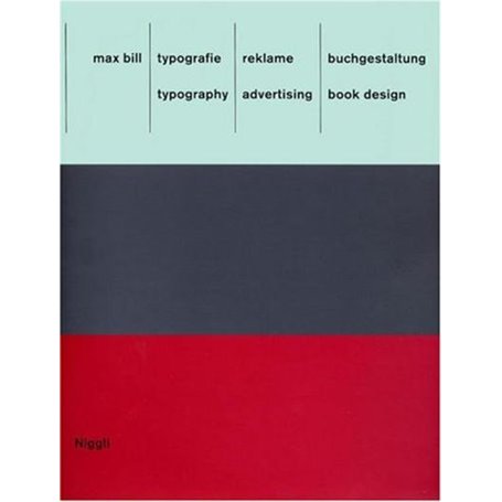
Typography. advertising. book design - Typografie. reklame. buchgestaltung
Format ReliéAuteur : Max Bill

Livraison à Mayotte tout compris

Retours et SAV simplifiés

Garantie Isleden
Description
The book at hand offers a comprehensive view into an area of work from Max Bill that has so far received little attention: typography, advertising and book design. One discovers Max Bill as the tireless creator of highly individual types and commercial logos as well as a designer with a sense of visual humor - not exactly a common aspect of constructive design in this country.Bill pursued two opposing principles and accordingly left behind two lines in his work: a graphic one and a sculptural one. Taking Herbert Bayer's universal type as a point of departure, Bill developed two lettering schemes for the Neubühl housing development and the firm "wohnbedarf", which departed from all then-known forms. The reason for the stretched "o" in "wohnbedarf" may well have been grounded on how one perceives the text from the side yet, behind this understanding lie formal ideas and the reductionist concept of the Bauhaus.
Caractéristiques
Caractéristiques
- Format
- Relié
- Auteur(s)
- Max Bill
- Collection
- NIGGLI EDITIONS
- Date de parution
- 17/03/2011
Livraison à Mayotte avec Isleden
🇾🇹 Commandez en ligne et bénéficiez d’une livraison à Mayotte sans frais de douane. Isleden vous permet d’acheter facilement et de recevoir vos produits avec un service fiable et transparent.


